Inspirational Website Design: Sparking Creativity Online
When it comes to web design, finding inspiration is a crucial part of the creative process. Whether you’re a professional designer or someone looking to create a personal website, the design choices you make can greatly impact the overall look and feel of your site. In this article, we’ll explore the concept of inspirational website design and showcase some remarkable examples to help you ignite your creativity.
Exploring Inspirational Website Design
In the vast landscape of the internet, not all websites are created equal in terms of design. Some stand out as truly inspiring, while others blend into the digital background. But what exactly makes a website design inspirational?
The Power of Colors in Web Design
Colors play a vital role in web design. Inspirational web design goes beyond the surface level use of colors that are readily available in design software. It’s about the artful combination of colors to create a unique and unforgettable visual experience. It’s the ability to take ordinary elements and transform them into works of art in their own right.
Leaving a Lasting Impression
An inspirational website is one that etches itself into the memory of its visitors. It has the power to compel them to return, not out of necessity, but for the sheer pleasure of revisiting. Even if stumbled upon accidentally, such websites cannot be ignored. They leave an indelible mark—a testament to exceptional creativity.
A Designer's Source of Inspiration
Inspirational websites serve as a wellspring of ideas for designers. They function as a canvas from which designers can draw elements and concepts to infuse into their own creations, giving birth to new inspirational websites in the process.
The Rewarding Journey of Web Design
While the pursuit of inspirational websites may seem endless, the journey itself is incredibly rewarding. To aid you on this journey, we’ve curated a list of exceptional websites demanding attention, regardless of your designer status. These websites showcase the limitless possibilities of web design, each a masterpiece in its own right.
In the following sections, we’ll delve into specific examples of inspirational website design, exploring what makes them unique and how they can serve as a wellspring of ideas for your own web design projects. Let’s dive in and get inspired!
Zincubate’s Refreshing Aesthetic
Zincubate’s website employs refreshing colors with a soothing aesthetic. The combination of white and navy blue creates a simple yet captivating design that enthralls visitors. This site serves as a prime example of how effective color combinations can be in web design.
Panelfly: Brilliant Use of Colors
Panelfly boasts a brilliant design with captivating colors. Its landing page is both awesome and inspiring, showcasing the designer’s dedication and experimentation. It demonstrates that white can be inspiring when used correctly.
Mortenstrid.no: Awe-Inspiring Visuals
Mortenstrid.no is a cleverly designed website that truly inspires awe. Its striking visuals and animated elements, such as the cube man, provide a fresh and creative way to showcase talent and creativity.
Daguia: Whetting Appetites and Creativity
Daguia’s website not only stimulates your appetite for food but also ignites your creative spark. With a color-changing background and delectable food images, it offers a fresh perspective on a familiar concept, leaving you with a deep appreciation for the designer’s work.
MovieMark
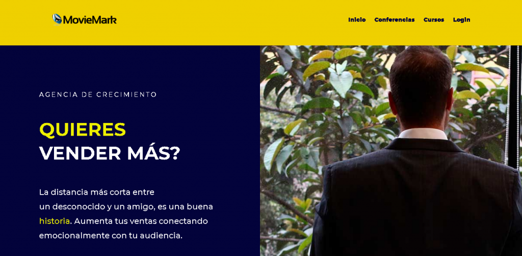
Digital Storytelling at Its Best
MovieMark is a growth marketing agency and HubSpot Partner, with a website that masterfully embodies digital storytelling, making it a perfect fit for their brand.
Slack
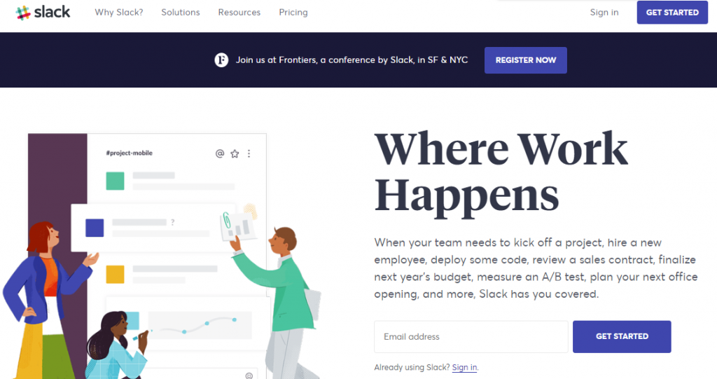
Illustrations and Clarity
I love the Slack homepage and it stands out with its unique custom illustrations and creative tagline, “Where Work Happens.” It effectively guides visitors to take action, whether signing in or creating an account.
Guillaume Tomasi
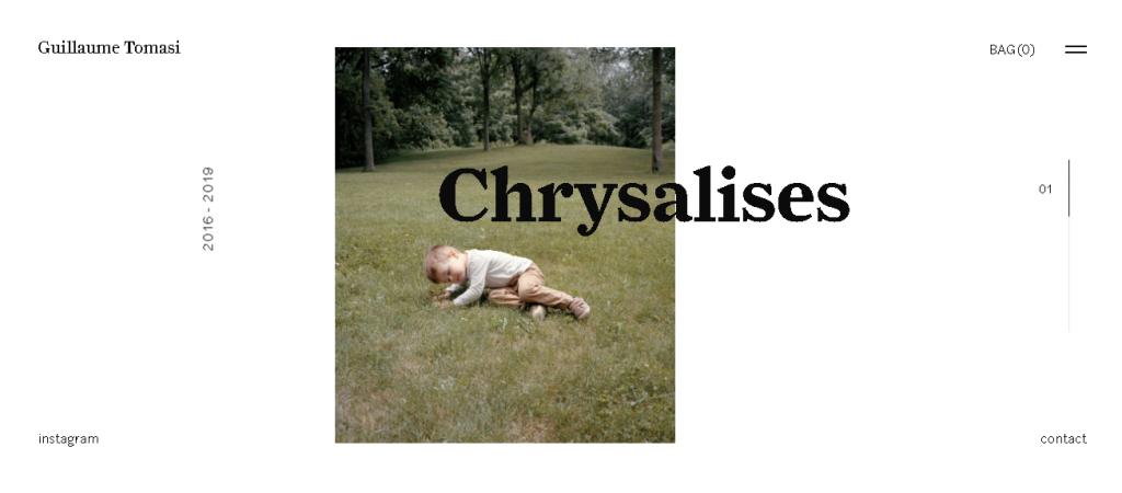
As a Photographer in Montreal, Guillaume Tomasi has built a portfolio that’s truly fit to house his unique and awe-inspiring photography. His surreal photo style is juxtaposed by his simple, flat, empty, and minimalistic portfolio design that places all of the focus on the work itself.
His unique series navigation coupled with art-gallery-inspired work introductions and perfect scrolling interactions yield an experience reminiscent of that of a real gallery.
Green Mountain Energy
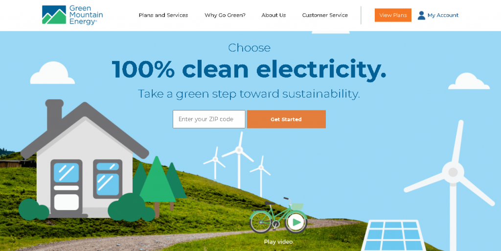
Going with another example of custom graphics. Green Mountain Energy leaves no doubt about the company’s purpose. It wants to provide clean energy at an affordable price. There are two equal CTAs — one for residential customers and one for business owners — that use contrasting colors to draw the eye.
CarMax
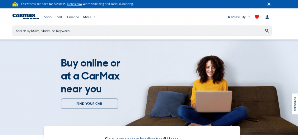
CarMax encountered a unique challenge when designing its homepage. The company both buys and sells cars, so it needed to cater to both audiences. As you can see, CarMax succeeds.
Multiple CTAs direct visitors to either find a car to buy or to sell their used car. Clean and simple. The hero image is clearly custom because you can see the CarMax logo on the vehicle’s license plate.
thredUP
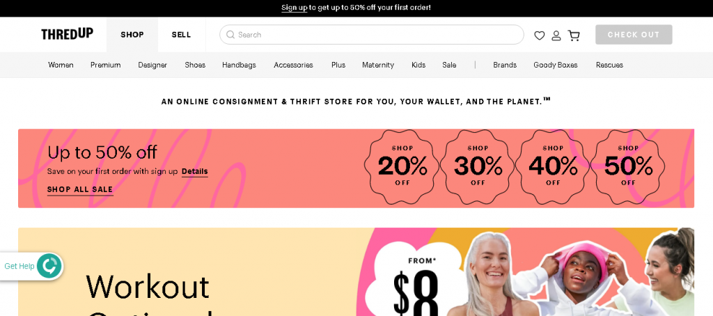
In thredUP’s case, the homepage goes for a seasonal approach. Apparently, boho style is in (at least for women), so we see a custom graphic that advertises lots of boho fashions available. The navigation is hefty but cleanly designed, so visitors can easily find the categories that interest them.
Ecommerce homepage design can get tricky. Do you introduce the business, show off your flagship product, or overwhelm your audience with tons of products or categories?
Hopefully, you don’t do the latter.
Suicide Prevention Hotline
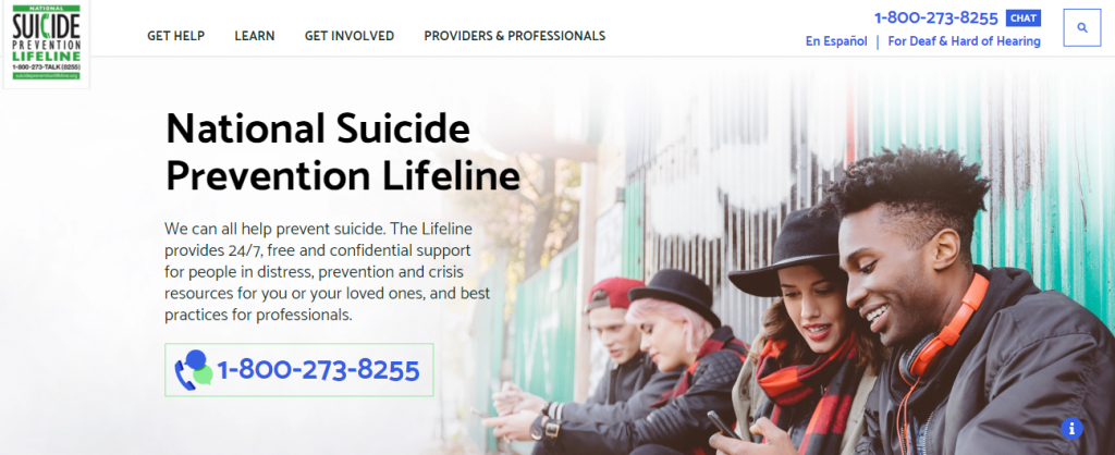
Nonprofits have their own obstacles when it comes to homepage design. They want to help as many people as possible but they also want to solicit donations, volunteers, and other help from the public. The Suicide Prevention Hotline accomplishes each of these goals well.
It’s interesting because the primary CTA is a phone number. This might sound antithetical considering what we usually see, but it’s designed for its audience. And if you’re surfing on your smartphone, you can click that number to dial it, which makes it particularly useful.
StudioPress
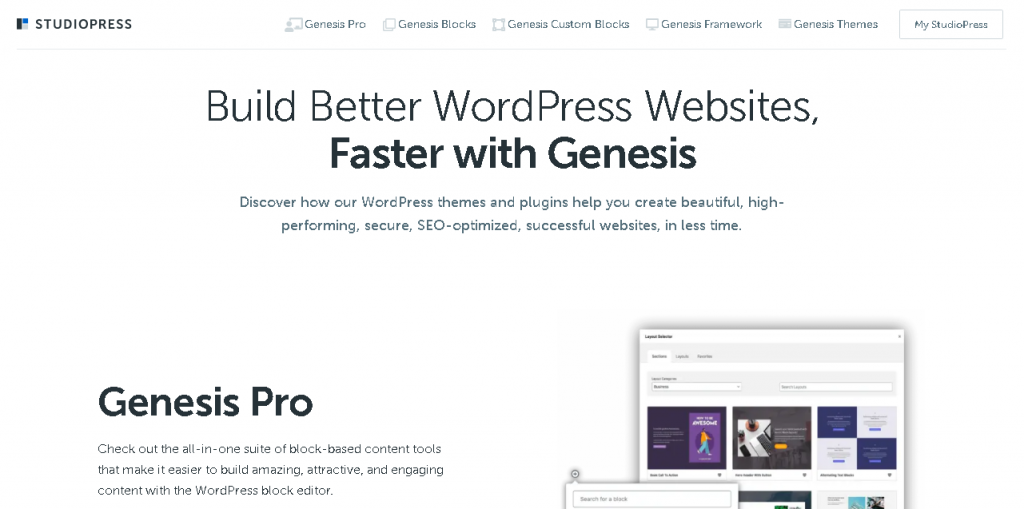
Minimal elements, flat design illustrations, and muted colors make the StudioPress homepage design shine. Thanks to the copy, you know exactly what StudioPress does for its customers: “Build Amazing WordPress Sites.” Then, you have three CTAs to choose from based on how you want to proceed.
The Motley Fool
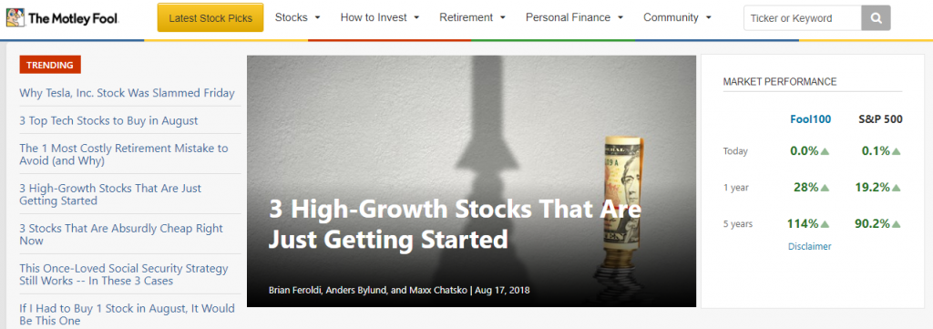
Lots of people use The Motley Fool exclusively for articles on finance, but the company offers much more. You’ll notice that one element sticks out on the page — the yellow CTA button that says “Latest Stock Prices.” If you click it, you’re taken to the company’s paid services, which involve providing you with stock picks from analysts and experts.
FindLaw
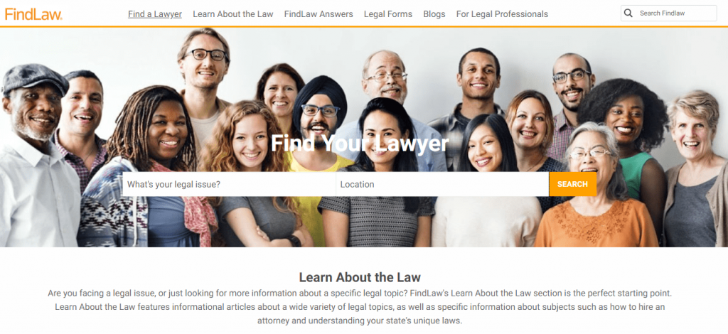
FindLaw has two purposes: educate people about the law and connect customers with lawyers. It caters to both purposes through its homepage design. You can use the top navigation to find educational information, but the primary CTA — centered over the hero image — encourages you to find a lawyer near you.
Viewership
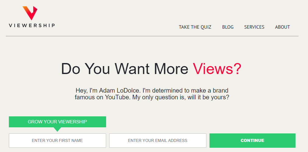
If you watch my YouTube videos, you know Adam and I have a regular Thursday series where we answer questions from people who have left comments on previous videos. Adam’s business, Viewership.com, focuses on helping people take advantage of video marketing.
The homepage design is ideal. We see the pink/red color in just two places and the green color in just two places. That’s how Viewership draws visitors’ eyes to relevant parts of the page.
Healthline
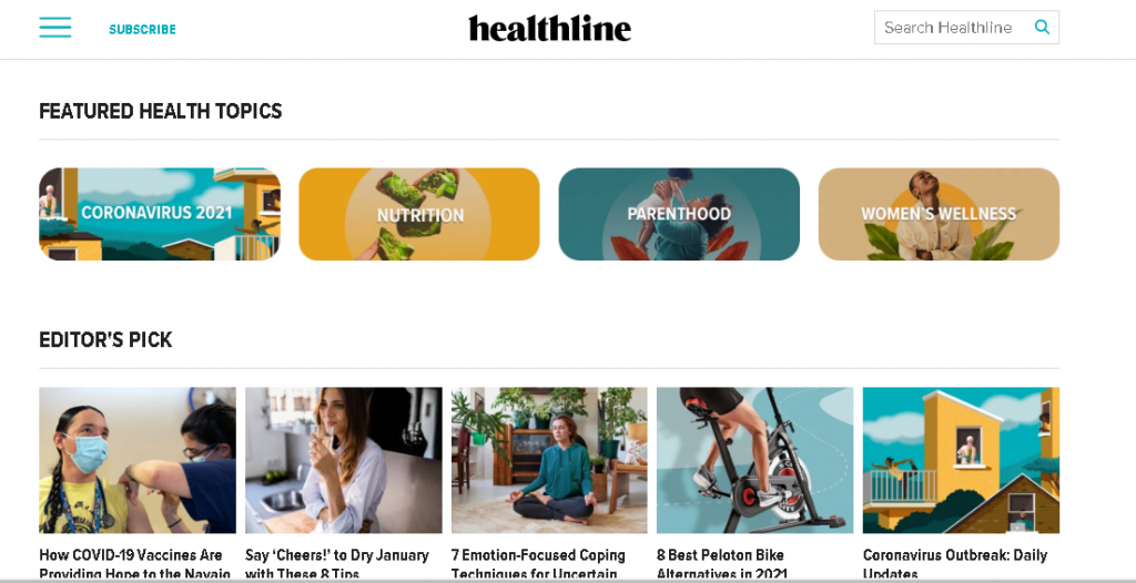
Sometimes, your approach to homepage design needs to reflect the type of website you’re building. In Healthline’s case, it’s primarily an educational publication that provides tips and insights into healthcare, nutrition, fitness, and more. This is an example of “showing, not telling” design. Instead of a big headline that says, “We Publish Articles About Health,”
Healthline demonstrates that fact with lots of article titles and excerpts above the fold. You also have access to a hamburger menu in the header, which can help you navigate to what you want, and a simple link for the site’s newsletter.
Crazy Egg
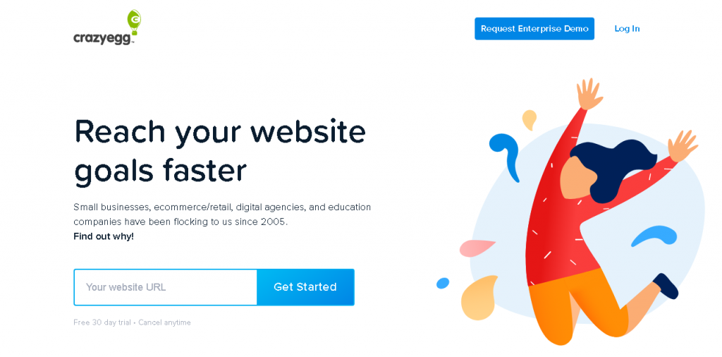
You didn’t think I would write this article without including Crazy Egg, did you? This website’s homepage focuses exclusively on encouraging the visitor to plug in their URL to view a heatmap. There’s also a link to start a 30-day free trial, with the trust-building “Cancel anytime” language right next to it.
You have social proof in the subhead, which tells visitors how many people trust Crazy Egg’s tools. If you scroll down, you encounter expandable content just below some more social proof.
Abacus Plumbing
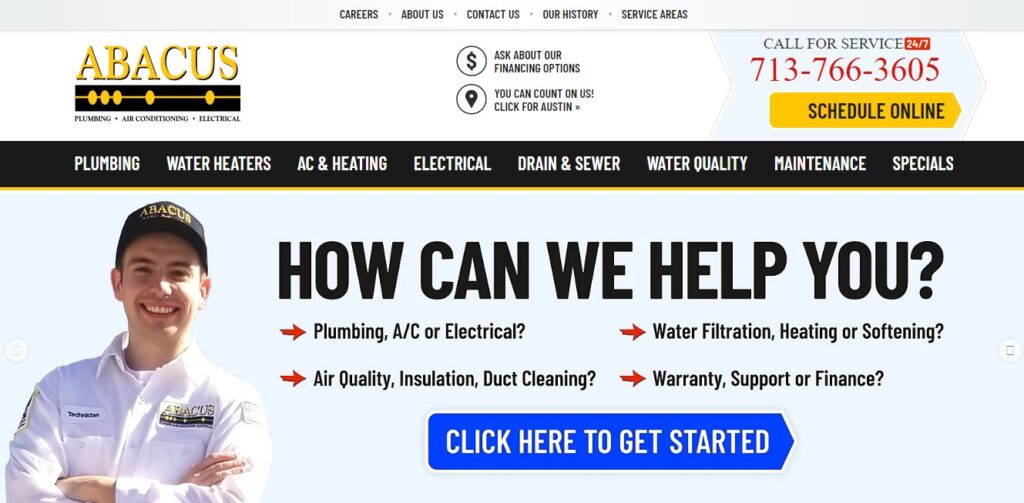
This is a lot different from the other examples on this page, but I really love how Abacus Plumbing has structured its homepage. It might look a bit cluttered, but this homepage includes a ton of social proof. The BBB accredited logo, the review count, and the words “You Can Count On Us” are all strategically placed.
The homepage highlights another trust-building element which is that customers will receive personal information about technicians prior to the technicians’ arrival. Customers can feel safer knowing that they’re actually opening their doors to an Abacus technician.
trivago
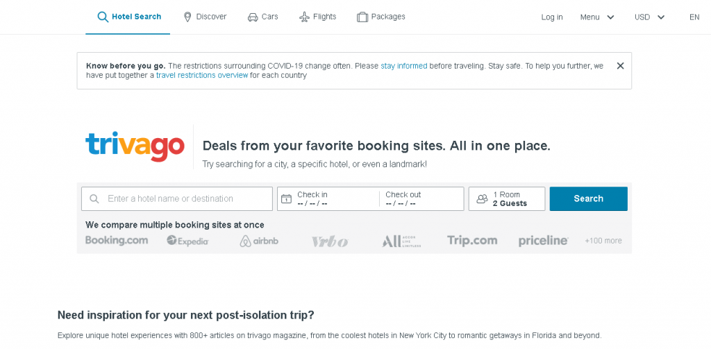
You might have heard me say once or twice that I love minimal design. You can’t get much more minimal than the trivago homepage design. It’s focused on one thing: Getting visitors to search for a destination. That’s it.
Century21
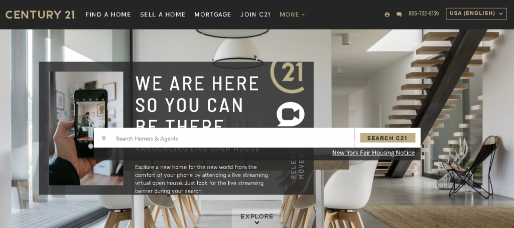
The word “relentless” caught my eye when I first saw this homepage design. If you were hiring a Realtor, wouldn’t you want him or her to be relentless? I would.
The homepage design is attractive and perfect for the Century21 audience. There’s a focus on searching for properties immediately from the homepage, but you also have access to useful navigation.
Marc Jacobs
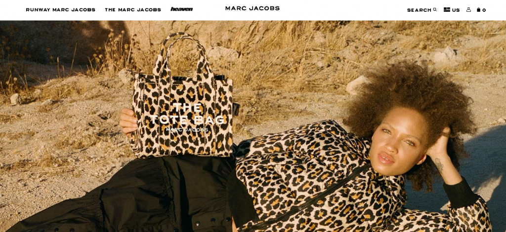
Nobody would ever call me a fashion expert, but I like the overall homepage design on the Mark Jacobs site. It’s minimalist and sophisticated, which fits the target audience, and the creative copywriting captures the attention of visitors.
Additionally, consumers will immediately notice the free shipping order in the top bar and the well-spaced navigation links.
Laura Worthington Fonts
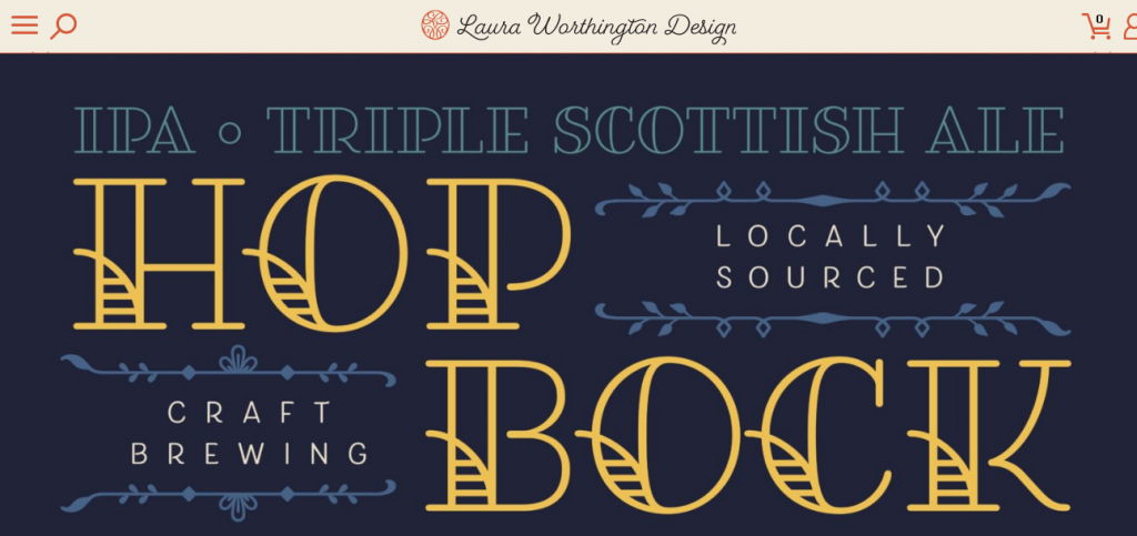
Laura Worthington has created a homepage design that reflects her approach to designing fonts. It’s feminine and colorful without overwhelming the senses.
At the same time, the elements don’t feel cluttered, and you know immediately what Laura Worthington sells.
Fitness Blender
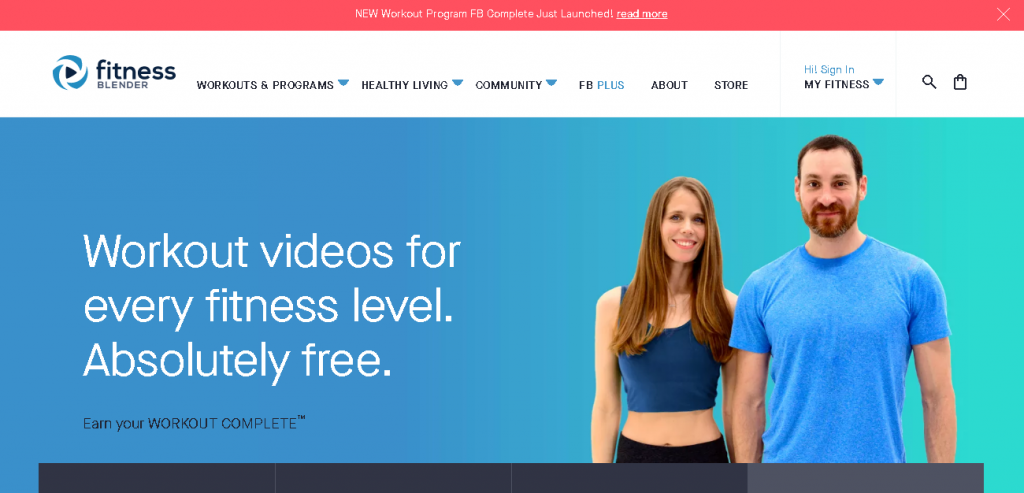
From the logo to the marketing copy, Fitnessblender has created an awesome homepage. With all the money people spend on the fitness industry, it’s refreshing — and compelling — to see a message that promises workout videos that don’t cost money. Sign me up!
You also have the male and female models, both of whom look fitness-ready, to capture attention and motivate the audience.
Nest
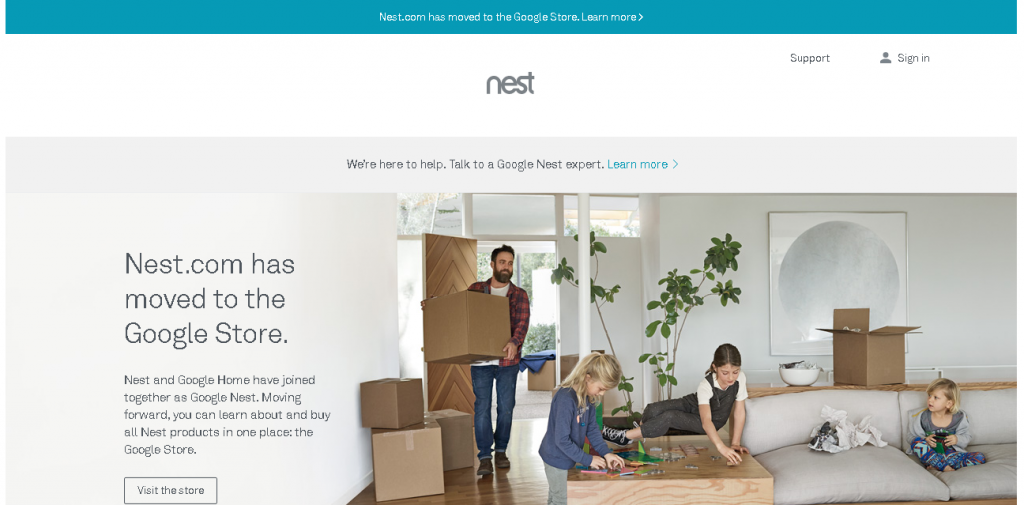
The copy and the imagery take center stage for the Nest homepage design. Here you see some elements of Apple’s design in this example. You have the product lined up in all its colors and the tagline “Saving energy never goes out of style.” The “Buy now” CTA tells visitors exactly what they should do next.
Toastmasters International
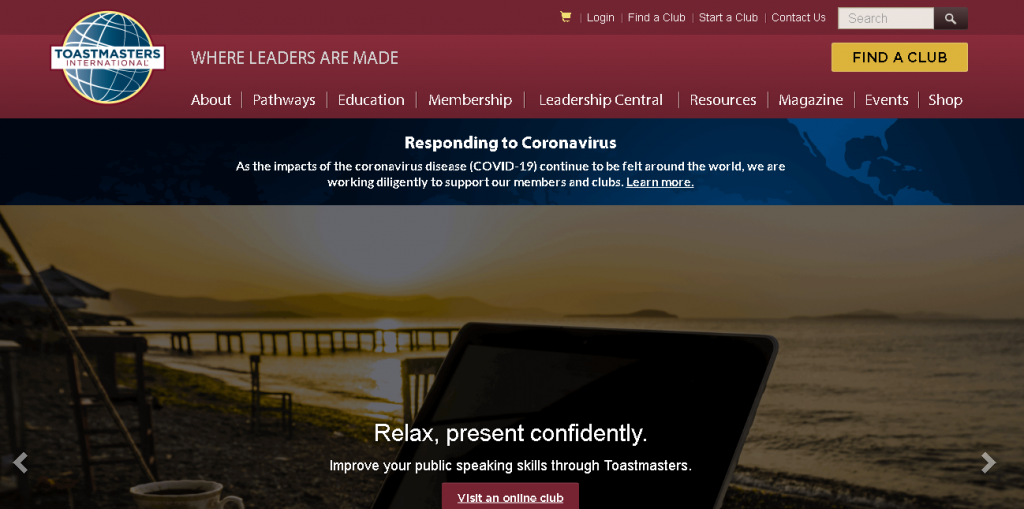
Although the Toastmasters International homepage design might seem a little dated at first, you have to remember its target audience. The organization wants to attract people — usually business leaders — and it does so well. I like the background images and the headline copy. Plus, the colors befit the tone and voice the organization wishes to express. If it doesn’t work for your business, you don’t have to use a pale color scheme or minimalist design. Feel free to experiment and figure out how best to represent your business.
Bookouture
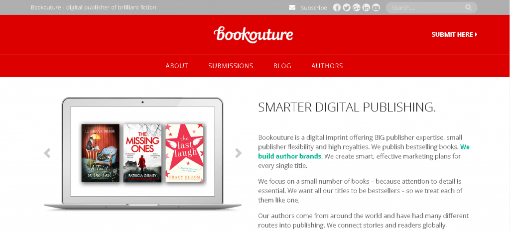
Here’s another example of a fairly minimal design. Bookouture is a digital publisher, primarily of romance and suspense novels, and its homepage targets authors who might want to publish their books here. The use of the computer image to show cover art is a smart one. In the header, you have a link for submissions, and below the homepage copy, there’s another CTA to learn more about what the company offers.
Ensurem
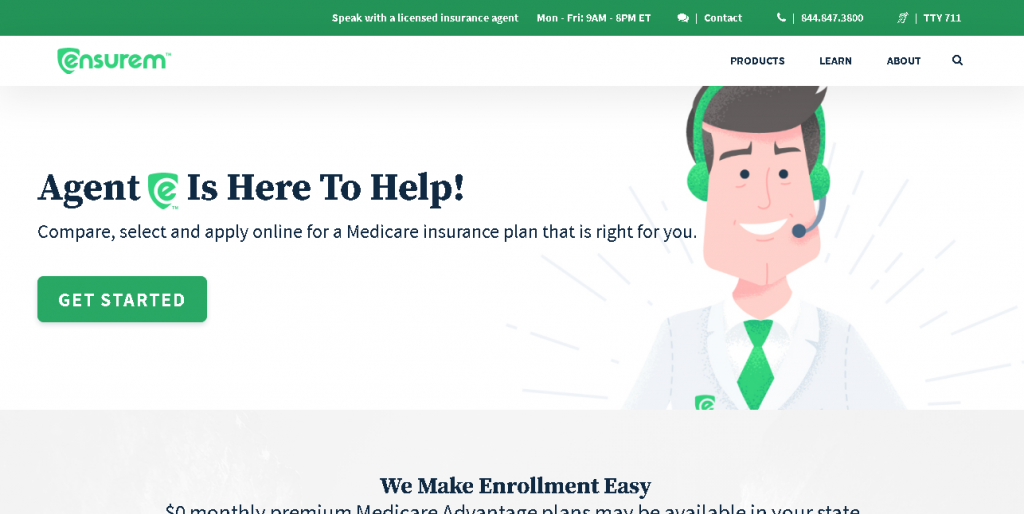
Ensurem is an example of a minimalist design that still feels cultured and fleshed out. The huge hero image helps, as does the dark color palette. You get a sense of refinement from the design. Particularly notable is the CTA. It’s big, the background is high-contrast, and the background color recalls the colors in the Ensurem logo. All fit together seamlessly.
L’Oursin
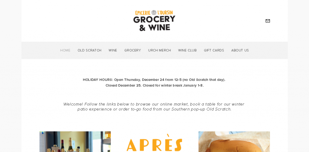
L’Oursin, a fantastic Seattle restaurant, totally nails the homepage design here. The photographs of food immediately tickle visitors’ taste buds, and you get a sense of the venue’s mood through its photographs and font choices.
UnitedHealthcare
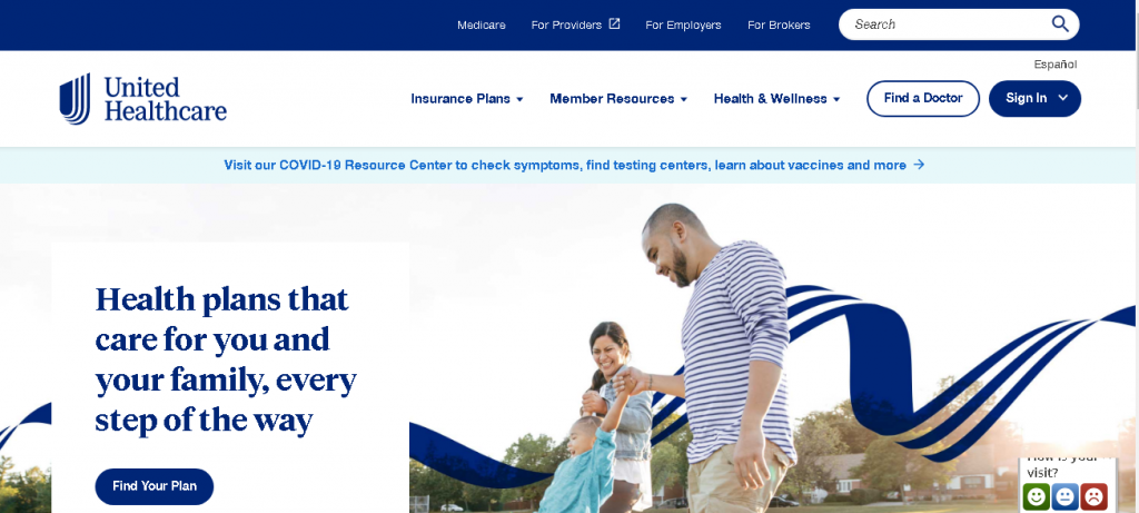
If you’re at all familiar with the psychology of color in marketing, you know that blue is often used to symbolize health and emotional healing.
That’s why UnitedHealthcare’s homepage design is so effective. Plus, it uses relevant images to help visitors feel at home, and multiple CTAs offer clear directions about how to proceed.
Lyft
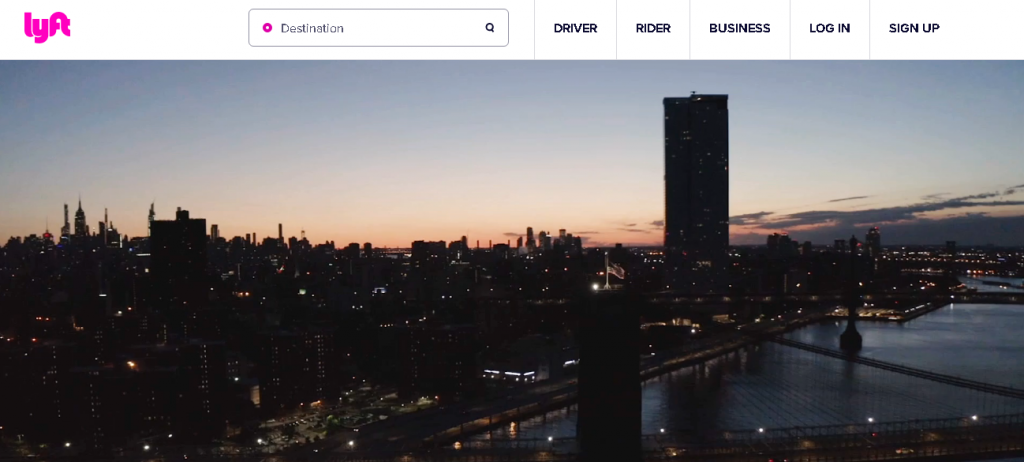
Lyft is a fantastic homepage that uses a clever custom illustration to attract viewers and includes a high-contrast CTA button. It also successfully caters to both riders and drivers.
Working as website designer
Working as a web designer requires a lot of creativity, skills, personal, and professional development. Those who perceive the world in a new way, find hidden patterns, make connections between seemingly unrelated phenomena, and generate solutions will always remain competitive in our dynamic world. Today we will talk about web design inspiration. The uncertainty with the question “How can I be more creative?” happens to everyone. This article will uncover the best website, app, and blog design examples for you. Additionally, our designers will share their tips and tricks too.
Ready to get inspired? This outlines the article for your convenience:
- Designoholic designers share where they get inspiration
- Best web design websites to boost your creativity
- UX Portfolio – The portfolio website to inspire your own website
- Takeaways for designers – How to never run out of ideas
Keeping up-to-date with the latest trends will help inspire your next project, and this article will serve as a handy tool for those who need a few more tips and where to get great website design ideas.
Best Designed Websites to Boost Your Creativity
Each designer at Designoholic has own approach to where to get inspirational ideas and new, sometimes innovative, solutions to the projects. So, here is a list of popular and unconventional places for design inspiration finding. Creativity and ideas are unlimited there, everyone will be able to find a cool idea that might become a reality in the future.
Latest insights, stories, and news
from Designoholic
